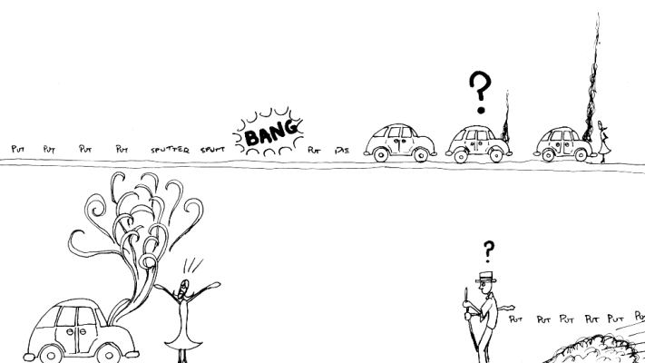
This is the page that I think made the waste of four hours planning worth it. The way it works as english speakers read is spot on. The salesman's entrance from the left leaves it as a punchline of sorts which was set up in a previous panel... and well, it just works. I could sit and explain for a long time about how I tried to approach this (and the other pages) page with the idea that the reader should get as much implied meaning as possible from panel placement and camera positioning, and bla bla bla. But I don't especially like it when DVD commentary directors get all philosphical, so I'll point out that vehicular motion should be indicated by a trail of "put"s much more often 'cause it's just so darn cute.
[the car bangs, then comes to a stop, smoke comes out of the hood ]
p2
[the woman yells as the salesman comes upon the scene]